Eight Timeless Wedding Color Palettes That Feel Anything But Basic
When it comes to planning a wedding, choosing your color palette is one of those decisions that sounds simple…until you’re staring at approximately 400 Pinterest boards wondering whether you’re a dusty blue bride, a champagne-and-ivory bride, or suddenly someone who wants everything to be burgundy.
Your wedding colors influence so much more than just your bridesmaids’ dresses or floral arrangements. They help establish the entire feeling of your celebration, from your invitations and wedding website to your tablescapes, signage, and all those little details that make the day feel like yours.
BUT… Timeless doesn’t have to mean beige. And colorful doesn’t have to mean trendy.
Some of the most beautiful wedding color palettes incorporate unexpected combinations, rich colors, interesting textures, and a little personality.
The secret isn’t necessarily choosing the safest colors. It’s choosing colors that work together, complement your setting, and feel authentic to you.
So, if you’re searching for wedding color palette inspiration that feels elevated, romantic, and anything but cookie-cutter, I’ve rounded up eight combinations inspired by real custom wedding invitation suites I’ve designed.
Let’s find your colors.
A Little Wedding Planning Help Before We Get Into the Pretty Stuff…
If you’re in the early stages of wedding planning, choosing your colors is just the beginning. And while picking out beautiful invitations is arguably one of the most fun parts (okay, I’m biased), figuring out exactly what stationery you need and when you need it? Not quite as glamorous.
That’s why I created a free Wedding Stationery Checklist to help you keep track of everything from save the dates and invitations to those little wedding-day details you might not even know you need yet.
Consider it one less thing to Google while you’ve got approximately 37 wedding planning tabs open.

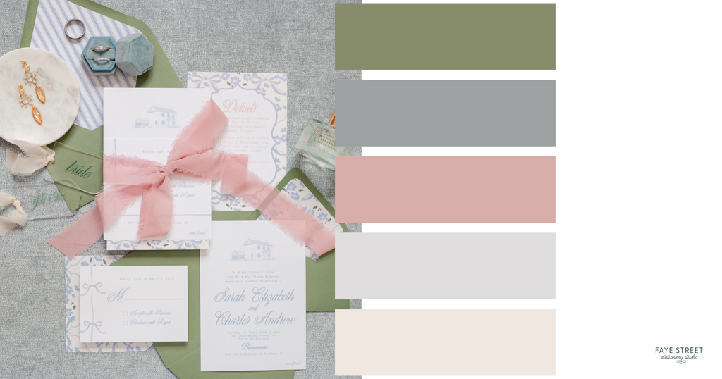
1. Sage Green, Dusty Blue & Blush Pink: Romantic Garden Wedding Colors
Soft, romantic, and just a little whimsical.
There’s something effortlessly beautiful about combining soft greens, powdery blues, and delicate pinks.
This palette feels like an English garden in the spring: romantic without being overly feminine, colorful without being overwhelming, and classic without feeling predictable.
The beauty is in the balance. Sage green grounds the palette, dusty blue introduces a cool softness, and blush pink adds just enough warmth.
For this custom invitation suite, we incorporated sage green envelopes, delicate blue-and-white patterns, soft pink ribbon, and romantic typography to create a layered design that feels cohesive without being overly coordinated.
How to bring this palette into your wedding:
- Sage green bridesmaid dresses or greenery-forward floral arrangements
- Blush garden roses, ranunculus, and white florals
- Dusty blue table linens or patterned napkins
- Romantic silk ribbon, patterned envelope liners, and delicate stationery details
The stationery connection: This combination is especially beautiful when the colors are introduced through different materials. Think colored envelopes, printed patterns, and silk ribbon rather than forcing every individual stationery piece to feature every color.
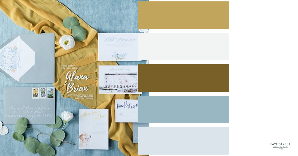
2. Dusty Blue, Marigold & Soft Green: An Unexpected Classic
For couples who love a little color without sacrificing elegance.
Blue and yellow might not immediately come to mind when you picture timeless wedding colors, but hear me out.
When you pair a muted dusty blue with a warm, golden marigold and touches of soft green, the result is unexpectedly sophisticated.
This palette feels cheerful, welcoming, and full of personality, especially for spring and summer celebrations.
In this invitation suite, blue envelopes, watercolor-inspired illustrations, golden fabric, and soft botanical details come together to create a look that’s playful but still refined.
How to bring this palette into your wedding:
- Dusty blue linens paired with warm golden floral accents
- Soft greenery and white flowers to balance the stronger colors
- Gold-toned details and romantic candlelight
- Watercolor venue illustrations and custom envelope liners
The stationery connection: You don’t need to incorporate your boldest accent color into every element. Sometimes using it in ribbon, illustrations, or a small design detail makes a much stronger impression.
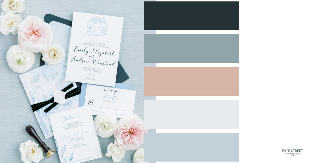
3. Powder Blue, Blush & Deep Teal: A Fresh Take on Romantic Wedding Colors
Classic romance with a little contrast.
If you love soft, romantic wedding colors but don’t want everything to blend together, this palette might be your perfect match.
Powder blue and blush pink create an airy, delicate foundation, while deep teal introduces contrast and sophistication.
It’s the kind of combination that feels equally at home at a spring garden wedding or an elegant indoor celebration.
For this custom invitation suite, we paired pale blue floral artwork with romantic calligraphy, blush and white flowers, and deep teal accents. The darker elements create just enough visual interest to keep the softer colors from feeling washed out.
How to bring this palette into your wedding:
- Powder blue linens or bridesmaid dresses
- Blush and ivory floral arrangements
- Deep teal ribbon, stationery accents, or table details
- Custom watercolor illustrations that bring the colors together
The stationery connection: Dark accent colors are especially useful in stationery design because they create contrast. A deep teal envelope or ribbon can make an otherwise delicate invitation suite feel more dimensional and intentional.
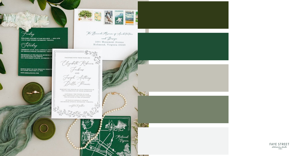
4. Emerald Green, Ivory & Antique Gold: Timeless Elegance
Traditional, sophisticated, and full of beautiful details.
Some wedding color combinations simply never go out of style.
Deep emerald green, creamy ivory, and warm metallic accents create a rich, sophisticated palette that feels especially beautiful for formal celebrations.
What I love most about this combination is that it doesn’t need a dozen different colors to make an impact.
In this invitation suite, rich green details, elegant typography, botanical illustrations, and vintage-inspired postage create a look that’s polished without feeling stuffy.
How to bring this palette into your wedding:
- Emerald green stationery, napkins, or velvet accents
- Ivory florals and abundant greenery
- Antique gold candlesticks, frames, or table details
- Vintage-inspired postage and elegant printed details
The stationery connection: Rich colors can be especially striking on paper. Pairing deep green with crisp ivory creates beautiful contrast, while specialty printing, textured paper, or vintage postage can add another layer of sophistication.
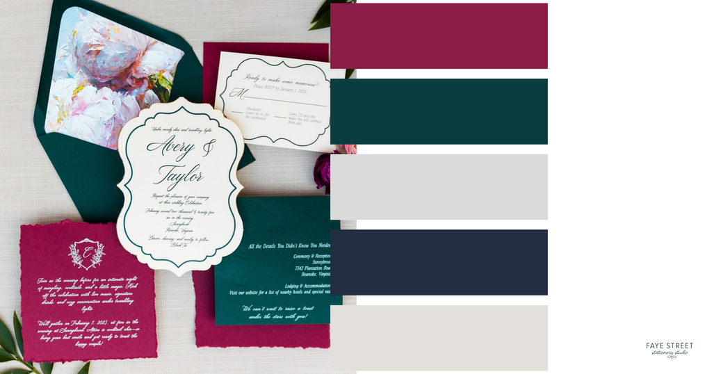
5. Deep Teal, Raspberry & Ivory: Bold Wedding Colors That Still Feel Timeless
For couples who aren’t afraid of a little drama.
Who decided timeless weddings had to be neutral?
Because personally, I think a rich teal and raspberry color palette makes a pretty convincing argument otherwise.
This combination is bold, romantic, and full of personality. Deep teal creates a sophisticated foundation, raspberry introduces warmth and energy, and ivory keeps everything feeling balanced.
The key is allowing the stronger colors to complement one another instead of competing.
For this custom wedding invitation suite, we paired richly colored paper with a uniquely shaped invitation, floral artwork, and contrasting details. The result feels expressive and luxurious without being overwhelming.
How to bring this palette into your wedding:
- Deep teal table linens or velvet accents
- Raspberry, burgundy, and pink floral arrangements
- Ivory candles and neutral tableware
- Statement stationery with custom shapes, colorful envelopes, or floral illustrations
The stationery connection: A bold color palette creates an opportunity to have some serious fun with custom stationery. Unexpected invitation shapes, richly colored cardstock, and specialty printing can turn your invitations into a design statement before guests ever arrive.
6. Soft Blush, Ivory & Champagne: Understated Romance
Delicate, refined, and effortlessly beautiful.
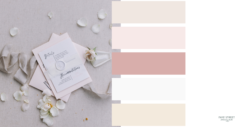
If your dream wedding feels soft, romantic, and understated, this palette is proof that simplicity can still make an impact.
Blush, ivory, and champagne create a warm, delicate combination that feels timeless without being overly traditional.
But what makes this palette interesting isn’t necessarily the colors themselves.
It’s the textures.
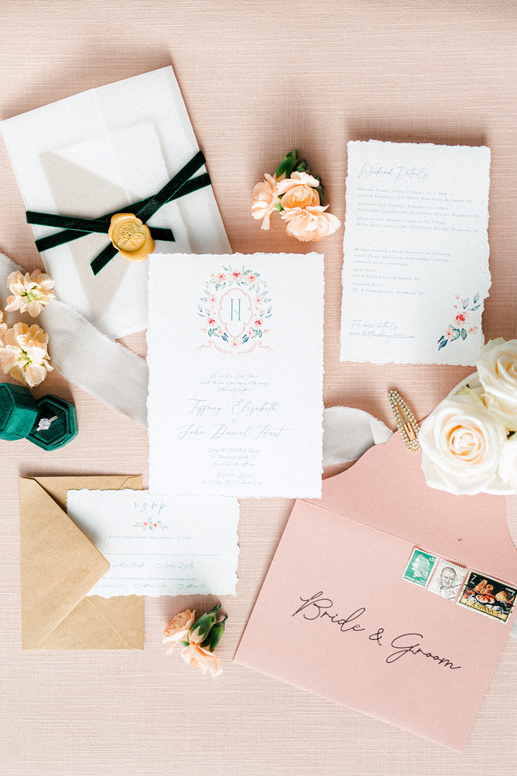
For this stationery design, soft paper tones, translucent vellum, a wax seal, and flowing silk ribbon create depth and dimension within an otherwise restrained color palette.
How to bring this palette into your wedding:
- Ivory and blush floral arrangements
- Champagne-colored linens and soft candlelight
- Silk ribbon, delicate lace, and textured fabrics
- Vellum overlays, wax seals, and handmade-paper-inspired details
The stationery connection: When you’re working with a subtle color palette, texture becomes incredibly important. Specialty papers, vellum, ribbon, and thoughtful printing techniques can create a luxurious invitation suite without introducing additional colors.
7. Dusty Rose, Cream & Soft Gray: Vintage-Inspired Wedding Romance
An heirloom-inspired palette with a personal touch.
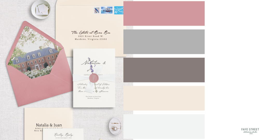
There’s something incredibly charming about dusty rose, creamy ivory, and soft gray.
This palette feels romantic and nostalgic without looking dated, especially when paired with delicate botanical artwork, architectural illustrations, and meaningful personal details.
In this invitation suite, dusty rose envelopes, creamy paper, soft gray typography, and a custom venue illustration come together to create something that feels elegant and deeply personal.
It’s a beautiful example of how a relatively simple palette can become memorable through the details.
How to bring this palette into your wedding:
- Dusty rose floral accents and romantic garden arrangements
- Ivory linens and soft neutral table settings
- Vintage-inspired decorative details
- Custom venue illustrations, meaningful artwork, and personalized stationery
The stationery connection: One of my favorite ways to elevate a classic wedding palette is through custom illustrations. Incorporating your venue, a meaningful location, or a personal motif creates a design that goes beyond simply coordinating colors.
8. Dusty Blue, Navy & Soft Ivory: Coastal Wedding Elegance
For couples who love coastal romance without the seashells-and-sailboats aesthetic.
There’s a reason blue is such a beloved wedding color. It’s classic, romantic, incredibly versatile, and when done right, feels effortlessly sophisticated.
But the secret to making a blue wedding palette feel anything but basic? Layering different shades, incorporating beautiful textures, and adding unexpected personal details.
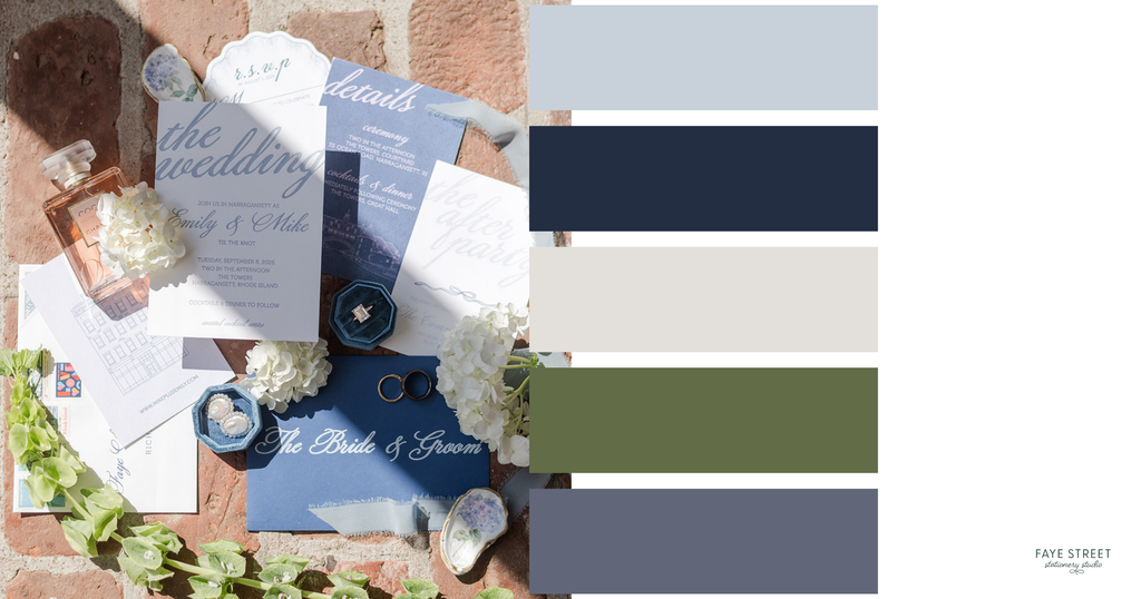
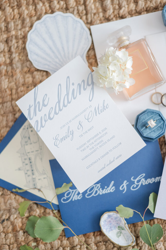
For my own Rhode Island wedding, I wanted our stationery to capture the feeling of a New England summer: relaxed, romantic, coastal, and just a little nostalgic.
We combined soft dusty blue, rich navy, and delicate ivory with subtle lavender accents, custom illustrations of our wedding venue, and thoughtfully designed details that carried through the entire celebration.
The result was a palette that felt coastal without being overly nautical and traditional without being predictable.
How to bring this palette into your wedding:
- Dusty blue linens, ribbons, and soft fabric details
- Navy accents to introduce depth and contrast
- Ivory and white hydrangeas for timeless coastal romance
- Subtle lavender or periwinkle details for an unexpected touch of color
- Custom venue illustrations and personalized stationery that reflect your wedding location
The stationery connection: One of my favorite things about designing our own wedding invitations was getting to create a cohesive visual experience that extended beyond the paper. From the custom illustration of The Towers in Narragansett to the blue tones and personal details woven throughout the suite, every element was designed to give guests a little preview of the celebration to come.
Want to see how this color palette came to life beyond the invitations? I shared a behind-the-scenes look at designing our own coastal wedding stationery, including the custom illustrations, paper details, and little personal touches that carried throughout our Rhode Island wedding.
See Our Coastal Wedding Stationery & Design Details →
How to Choose a Timeless Wedding Color Palette That Actually Feels Like You
Now that we’ve covered some of my favorite wedding color combinations, let’s talk about choosing the right one.
Because as beautiful as a Pinterest mood board might be, your wedding colors should make sense for your actual celebration.
Start with your venue. A historic estate, waterfront venue, modern rooftop, and garden setting all have different architectural features, textures, and natural surroundings. Your palette should complement those elements rather than compete with them.
Think about the atmosphere you want to create. Romantic and intimate? Bright and celebratory? Moody and sophisticated? Your colors can help communicate that feeling before guests ever arrive.
Choose a few foundational colors and build from there. You don’t need eight equally prominent colors. Start with two or three main shades, then introduce complementary neutrals and accents to create depth.
Consider the materials, not just the colors. Velvet, silk, linen, handmade paper, vellum, and metallic finishes can make the exact same palette feel completely different.
And perhaps most importantly…
Don’t choose a color palette just because it’s trending.
Your wedding should reflect your personalities, your story, and the experience you want to create. If that means a classic ivory-and-green wedding, beautiful. If it means deep teal and raspberry with a uniquely shaped invitation and colorful floral details? Also beautiful.
There’s no rule that says timeless has to be predictable.

Your Wedding Invitations Are the First Introduction to Your Color Palette
Here’s where I get particularly excited.
Your wedding invitations are one of the first opportunities to introduce guests to the atmosphere and aesthetic of your celebration.
Long before anyone sees your flowers, reception tables, or wedding signage, they’re opening an envelope that gives them a little preview of what’s to come.
And that experience can be so much more than a card with your names and wedding date.
The colors, paper, typography, printing techniques, artwork, and finishing details all work together to tell a story.
Maybe that’s a custom illustration of your venue. Maybe it’s a beautiful patterned envelope liner, a romantic silk ribbon, or an unexpected pop of color that carries through to your wedding-day details.
The goal isn’t to make every element of your wedding match perfectly.
It’s to create a thoughtful, cohesive experience where everything feels like it belongs together.
And when you work with a custom wedding stationer, you have the freedom to create those details intentionally rather than trying to make a predesigned invitation fit a vision you’ve already fallen in love with.
Let’s Make Something Beautiful
Whether you’re dreaming of soft romantic colors, rich jewel tones, or something completely unexpected, your wedding stationery should feel as personal and thoughtfully designed as the celebration itself.
At Faye Street Stationery Studio, I work with couples to create custom wedding invitations and wedding-day paper details that reflect their style, tell their story, and give guests a beautiful first impression of what’s to come.
Because your invitations shouldn’t just announce your wedding. They should feel like the beginning of it.
Found Your Colors? Let’s Bring Them to Life.
Whether you’ve fallen in love with soft, romantic neutrals or you’re dreaming of bold colors and unexpected details, your wedding stationery should feel like a natural extension of your celebration.
And that’s where I come in.
At Faye Street Stationery Studio, I create custom wedding invitations and wedding-day stationery that go beyond simply matching your color palette. We’re talking thoughtfully selected papers, beautiful printing techniques, custom illustrations, unexpected details, and designs that feel completely, unapologetically you.
Because your wedding invitations aren’t just another item to check off your planning list.
They’re your guests’ very first glimpse into the celebration you’re creating.
Explore Custom Wedding Stationery →
Before You Mail the Pretty Paper…
You’ve found your colors, now let’s talk logistics. Because knowing when to send your invitations and what it’ll cost can save you a whole lot of last-minute stress.
The True Cost to Mail Wedding Invitations: A Complete Guide
Spoiler: One stamp isn’t always enough. Here’s what you need to know about postage, extra fees, and mailing your invitations.
The Wedding Invitation Timeline No One Tells You About
When should you design, order, and mail your invitations? Here’s how to plan ahead and avoid the last-minute stationery scramble.
